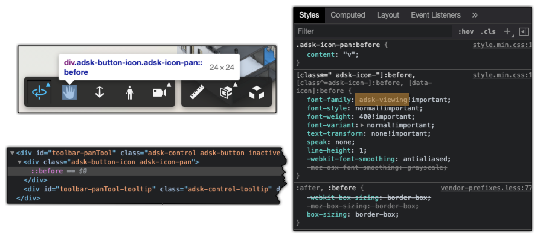
When creating buttons, you can just add an image (png, svg, etc) to it relying on styles in the CSS, as done here as well.
One problem is that the blue highlighting when hovering above the button or when it's in pushed state, will not happen as in case of standard Viewer toolbar buttons.
First I tried using an svg image as background added like here, but could not adjust the color of the image.
The fill property shown here did not work either when the SVG is referenced through either the content or background-image CSS properties. The SVG content would need to be present inside the HTML, as in the referenced sample as well.
How does the Viewer do it?
It's creating a font-family whose letters will contain the icons - search for font-family: 'adsk-viewing' in the Viewer's CSS

That's a very common way of providing icons - see e.g. Bootstrap Glyphicons or Font Awesome Web Application Icons
If you're OK to use one of the icons provided by the Viewer, those are the easiest to use. Once you created your toolbar button, you can just set its icon to the one you want using its name, e.g.:
let button = new Autodesk.Viewing.UI.Button('myButton');
button.setIcon('adsk-icon-measure');
If you need something else, I hope you can find them in one of the free font-families provided by the above mentioned sources like bootstrap.
In that case you will likely have to assign multiple classes to the button, so you would need to add them to the icon's classList:
let button = new Autodesk.Viewing.UI.Button('transformExtensionButton');
button.icon.classList.add("fas", "fa-arrows-alt");
See source code of the TransformationExtension sample extension - image on top shows the result.
