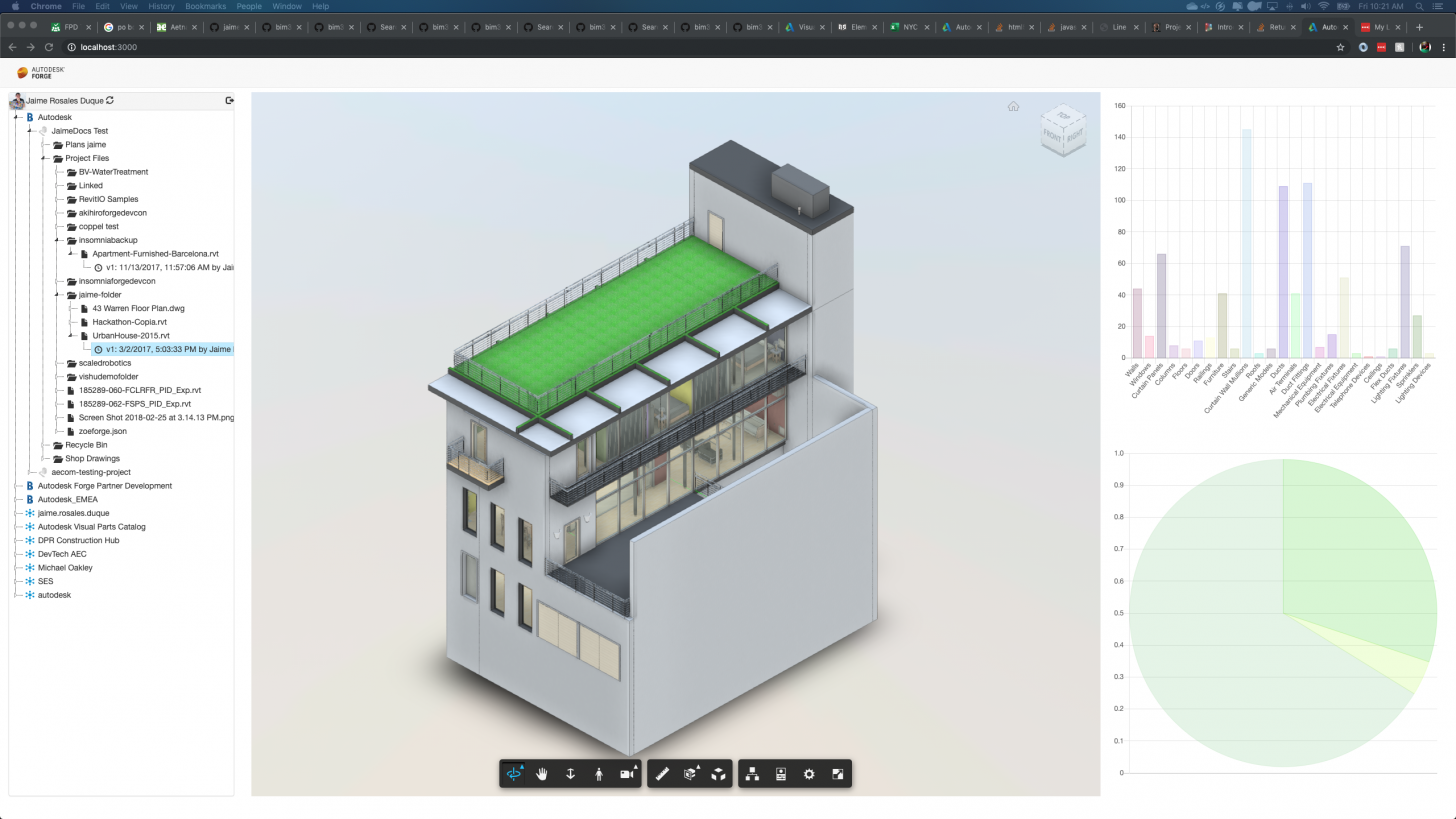
In preparation for Forge DevCon Lab series, We added a new section to the Tutorial in order to help you create a Dashboard functionality that will let you visualize a different representation of your CAD model data.
We wanted to keep this as simple as possible, fewer steps to reach the main goal which was to give you representation of your CAD data in bar and pie charts. The Viewer contains a lot of data from the model, but we need to filter and adjust to our dashboard. We decided to go with Chart.js - Simple yet flexible JavaScript charting for designers & developers.
Follow the steps on the Tutorial to create the new workflow on your Forge App - Dashboard Tutorial

If you are joining us at Forge Devcon and Autodesk University this year make sure you sign up for the Lab I will be running.
Here is a link for you to join my class! Dashboard Lab

